


Less than a month after he introduced it, Governor Inslee’s COVID-19 Risk Assessment Dashboard has become irrelevant. The most recent update demonstrates the dials do not accurately reflect the true underlying data, are influenced by data which are not available, and are, instead, based on outdated information.
This is particularly true of the dial that is most influenced by state policy – testing. Increased testing is vital if Washington state policymakers are to understand the extent and risk of the coronavirus. The more uncertainty there is, the more likely the Governor is to maintain harsh economic restrictions that are the blunt instrument approach to be used only when more precise data is unavailable.
The most recent update of the testing dial on the COVID-19 dashboard is clear evidence that the state has not only failed to take steps the governor and Department of Health (DOH) say are critical but are trying to hide that failure.
Over the past week, we have noted that the data provided by the DOH shows the average number of daily COVID-19 tests is falling and has been for weeks. Despite that trend, the most recent update of the dashboard’s “Testing Capacity and Availability” dial was moved in the positive direction. The paragraph under the dial explains, “Status has improved slightly this week. Daily testing numbers remain very roughly steady, up from typical April volumes, but not continuing to increase” (emphasis mine). The narrative does indicate that although testing supplies are limited, “the state has very recently received significant shipments from the federal government.”
The dashboard is supposed to provide a data-driven, science-based indication of the status of efforts to fight COVID-19. The phrase “very roughly steady” shows how imprecise and unscientific it actually is. Additionally, another way to say that testing is “not continuing to increase” is “declining.” This vague language is intentionally misleading, designed to replace the clarity of the data with opaque, political rhetoric.
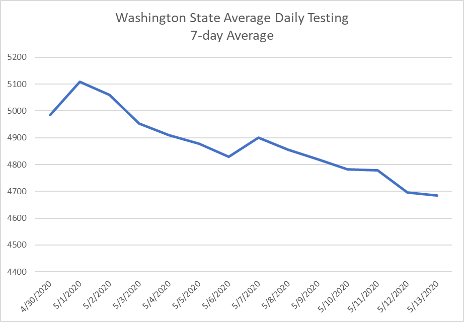 Using the most updated information, a seven-day average of Washington’s daily testing shows a steady decline since late April. Averaging the data removes some of the daily variability and adjusts for the weekends when testing falls dramatically. With such a clear and continuous trend, what is the governor’s justification for improving the status of the testing dial on the COVID-19 dashboard when the trend is clearly negative?
One claim is that testing data is incomplete, so the trend may not be downward after all. In fact, the graph on the DOH page highlights the fact that recent data may not be complete. In the underlying data table, DOH staff recently started categorizing data as complete or incomplete. That table shows that as of May 21, the most recent complete data was more than a week old, from May 12. Our previous analysis, however, took account of this uncertainty. Using only confirmed data does not change the downward trend we identified last week.
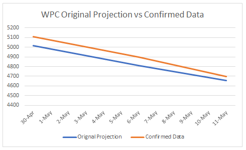 While there are changes in the testing numbers as new data trickle in, the adjustments don’t make a significant difference and they don’t change the trend. When we published our blog analyzing the testing trends one week ago, we used the most recent data, which included some data listed as incomplete. Since then, the data have been updated and are now confirmed. The chart to the right shows the difference between our original projection available in the blog, and the final numbers. The difference is about one percent and the trend did not change. The new, confirmed numbers verify our original analysis.
It is also problematic that the most recent data the DOH lists as reliable are over a week old. Since May 12 there have been two updates to the Governor’s COVID dashboard. Those updates were both based on data DOH says is unreliable. If the Governor and his staff are using this data to make decisions, they are using information that is, at best, a week out of date.
The only other data available for the testing dial is “laboratory analysis capacity.” This information, however, was last updated on May 9. It should not have contributed to the improvement between the May 13 and May 20 shown on the governor’s dials.
The description of the testing dial indicates there are other considerations, including “collection materials,” as well as “supply chain, community accessibility, and test turnaround times.” There is no data available for any of these, however. Since the two data sets we do have are either outdated or trending downward, the only reason the testing dial could have been set to show improvement is based on one of these mysterious categories. Rather than making things more transparent, the testing dial now relies entirely on data which are hidden.
A lack of transparency is the best explanation for the improvement in the dial against the trend of the available information. The alternative is that the dial is intentionally misleading, portraying improvement to the public to hide a situation that is actually getting worse.
After less than a month, the state’s COVID-19 dashboard is already useless. The data are either out of date or unavailable. Worse, the dials don’t have a discernible relationship to the data that are available. It now appears that the dashboard was simply an attempt to create the appearance of data-driven decision-making rather than a commitment to real transparency with a basis in science.
The Governor won’t remove the dashboard. That would be embarrassing. His staff will simply continue update the dials without addressing the failures of the current system. For the rest of us, however, it should be a reminder that when facing the greatest economic and health challenge in a century, our state leaders are substituting empty style for scientific seriousness.
The Olympian covered this information with a front page story on Monday May 25.