

On April 29, Governor Inslee released a series of dials called the “COVID-19 Risk assessment dashboard,” reflecting the data he claims to be using to make decisions about reopening the state economy. He told the reporters that he was doing this “so we can be completely transparent with Washingtonians about how we are making these decisions,” which he promised he is doing “based on data and science.”
Analysis of that dashboard and the dials, however, shows this is simply not true and there are several problems. The dial settings do not match the underlying data trends. There is no data for some of the dials. The dials are extremely imprecise, and some of the metrics the governor uses are meaningless.
These flaws are even more obvious when compared to New York’s detailed and specific dashboard, which includes clear targets and transparent data.
The governor’s dashboard is not science. It is political guesswork masquerading as science. The dials on the dashboard are not based on the underlying data.
Here are four problems.
1. Daily testing is getting worse, but the dials show the opposite
The dial for “Testing Capacity and Results” stayed the same this week after improving last week. Based on the data provided, however, the testing dial should have moved backward. The state went from an average of 5,015 tests a day when the dials were introduced on April 30, down to 4,812 tests a day when the dials were updated last week, and down again to 4,656 for the seven days ending last Monday.
Despite that, the narrative on the COVID-19 Dashboard page says, “Daily testing numbers remains fairly steady at approximately 6,000 on weekdays, up from typical April volumes.” In fact, weekday testing is also declining and is now below 6,000 per day. For the week of April 27 through May 1, the state averaged 6,142 tests per day. For the following week, weekday testing fell to 5,714. The dial, on the other hand, misleadingly showed improvement.
This is a critical metric and the governor’s staff do not want to show that the number of daily tests is declining. So, they kept the dial where it is and misrepresented both the amount and trend of daily testing.
2. The data are not reliable or missing
For many of the dials the data they are supposed to represent are outdated or missing. For example, the testing capacity data hasn’t been updated since May 6. The data for the COVID-19 cases in Long-Term Care Facilities hasn’t been updated since May 8.
Additionally, the last week of data for daily testing has a note saying, “Data may be incomplete for the most recent dates.” This is probably the response the governor’s staff would provide about why the number of daily tests is declining – that the data are incomplete and will be higher when all data are available. The downward trend is longer than just the recent data, however, so this is probably not accurate. But, if this is true, what good are the dials if the data they are supposed to represent are out of date?
3. The data are very imprecise and leave room for political manipulation
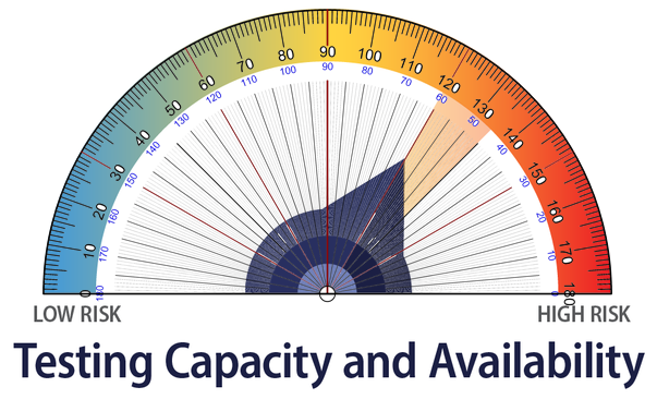 Each time one of the dials moves, it is adjusted in increments of 15 degrees on the 180-degree semi-circle. This means there are 12 increments, so the dials are essentially a scale of 1 to 12. This isn’t very precise and, as the above problems demonstrate, leaves a great deal of leeway for unscientific subjectivity.
We can show mathematically how imprecise and subjective the reported numbers are. In the first week after the dials were released, three of the dials moved by the same 15-degree increment. Each dial, however, is supposed to be based on different underlying data, so the chances of all three moving by the same amount in the same week is about 1 in 200.
These unlikely circumstances occur because the imprecision of the dials allows politics to determine the movement of the dials, so even when the data do not justify it, politics – whether that means making the governor look good or using the dials to justify a particular policy – can give them a nudge in the preferred direction.
4. Some metrics are odd and meaningless
One of the metrics is “Risk to Vulnerable Populations” and the data are broken out by various demographic groups. For example, the data show that women represent 52% of COVID-19 cases, compared to 46% of men, and 2% unknown. Men, however, account for 54% of deaths, compared to 45% for women, and 1% unknown. My question is what would make the dial move in a positive direction? If more women to die of COVID-19 would it even out the data?
The data are even more skewed by age. Although people in the age group 40-59, like me, represent 34% of the cases, we account for only 9% of deaths, in part because people in this age category are particularly hearty and intelligent. Increasing the death rate among this important age category would be counterproductive and unjust, even if it did even out the averages.
Additionally, what are the policy mechanisms elected leaders would use to even out these numbers? Shift more hospital resources to caring for men and move them away from women? This is a strange and meaningless metric.
The health and economic costs of the COVID-19 crisis are the most serious we’ve seen in at least a century. The governor is having people sacrifice a great deal, particularly jobs and businesses that may never return. The word “science” appears to be used to hide data and forestall criticism and open discussion. Instead of using the COVID-19 dashboard to demonstrate transparency and build confidence in the government’s response, it has become another political tool that hides the reality and creates more public mistrust.